AI Transformation Progress Monitoring: 2026 Strategy Guide
AI programs do not fail because leaders forgot to ask about ROI. They fail because ROI arrives too late to steer the work.
Strong ai transformation progress monitoring starts earlier and goes deeper. It tracks whether the model is reliable enough for production, whether teams change how work gets done, and whether that change shows up in cost, revenue, speed, or risk reduction. A single financial number cannot carry that job on its own.
That distinction matters once a company moves past experimentation. Pilot teams can survive on usage screenshots and anecdotal wins. Scale cannot. I have seen founders approve a promising assistant, document classifier, or forecasting model, then stall in pilot purgatory because nobody measured handoff rates, exception volume, cycle-time reduction, or adoption by the people doing the work every day. For a practical example, an invoice OCR AI workflow should be monitored for extraction accuracy, review time, straight-through processing rate, and downstream finance impact, not just whether the model produced an output.
Companies that get AI into production treat monitoring as part of delivery. The standard is simple. Measure model performance, operational change, and business results together. That is how teams spot weak adoption before it hurts throughput, catch process bottlenecks before finance asks where the returns went, and separate real transformation from a pilot that only looked good in a steering meeting.
Beyond ROI Defining Outcome-Linked AI KPIs
ROI is a lagging indicator. By the time you're arguing about it, the implementation has usually already gone off course.
A better approach starts with a simple distinction. Leading indicators tell you whether the AI system is behaving correctly. Operational indicators tell you whether the workflow is improving. Lagging indicators tell you whether finance can see the effect. If you only watch the last category, you miss the middle where transformation either takes hold or stalls.

The missing middle is where most programs fail
Leaders often get a polished summary while frontline teams get a clunky tool. That gap is measurable. BCG's 2025 AI at Work survey, cited in this analysis, shows frontline employee adoption stalled at 51% versus 75%+ for leaders, and notes that user engagement and process redesign KPIs are often missing from monitoring.
That's why a chatbot can look successful in a board update and still fail operationally. Usage at the executive layer doesn't prove a claims team, support team, or AP team changed its daily behavior. If your metrics don't capture acceptance, handoff quality, review burden, and throughput, you're not measuring transformation. You're measuring exposure.
Practical rule: If a metric can't influence a decision in the next operating review, it probably doesn't belong in the first dashboard.
For example, a document AI workflow shouldn't be judged only by cost savings six months later. Early on, the better questions are narrower. Is extraction accurate on production data? Are reviewers accepting outputs without edits? Is manual intervention shrinking? In invoice-heavy processes, those questions matter more than a generic “AI ROI” line item. That's also why teams exploring invoice OCR AI workflows should define review, exception, and acceptance metrics before discussing broad financial payoff.
Use a three-layer KPI model
This structure works because it reflects how value appears.
| KPI layer | What it answers | Examples |
|---|---|---|
| Leading | Is the model producing reliable output in the real environment? | Production accuracy, recommendation acceptance rate, output consistency |
| Operational | Is the workflow changing in a useful way? | Cycle time reduction, fewer defects, lower manual review load, faster throughput |
| Lagging | Is the business capturing strategic value? | Margin improvement, cost savings, workforce reallocation |
The strongest monitoring systems connect these layers explicitly. If recommendation acceptance rises but cycle time doesn't improve, the model may be fine while the workflow is broken. If cycle time improves but finance sees no benefit, you may have localized efficiency without process redesign or budget capture. Each layer tests a different hypothesis.
Define value before delivery starts
A founder usually needs a short checklist, not a theory deck. Before building anything, lock in these decisions:
- Business event: What business moment should improve? Approval turnaround, support resolution, defect detection, underwriting prep, onboarding speed.
- User action: What behavior should change? Accept AI suggestions, skip manual steps, review only exceptions, escalate less often.
- System signal: What proves the AI is technically sound? Accuracy, latency, consistency, low drift.
- Process effect: What proves operations improved? Less rework, shorter queues, fewer errors, more completed units.
- Financial path: How will the gain show up later? Lower unit cost, better margin, higher capacity, faster revenue realization.
That discipline is what keeps ai transformation progress monitoring grounded in business mechanics instead of abstract model talk.
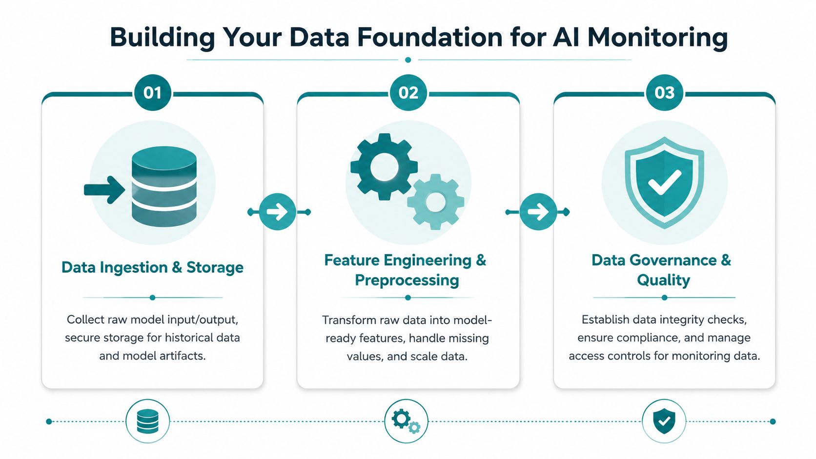
Building Your Data Foundation for AI Monitoring
Many AI monitoring problems aren't monitoring problems. They're instrumentation problems.
Teams launch a model, then realize they can't compare before and after, can't trace a bad output to the input that caused it, and can't tell whether a drop in quality came from the model, the workflow, or a source system change. That's why data foundation work has to happen first, even when it feels unglamorous.
Start with a baseline, not a model
A monitoring methodology summarized in this Success.com piece argues that rigorous tracking matters because 95% of AI projects fail, with workflow integration failures driving 67% of cases and data quality issues affecting many firms. Those numbers match what operators see in practice. The model is rarely the whole story. The handoffs are.
Before deployment, capture how the process works today:
- Current turnaround: How long the task takes from intake to completion.
- Manual touchpoints: Where humans intervene, validate, rekey, or correct.
- Error patterns: What goes wrong most often.
- Queue behavior: Where work piles up.
- Source quality: Which systems send incomplete, inconsistent, or late data.
Without that baseline, every post-launch conversation turns vague. People remember pain points selectively. Teams argue from anecdotes. The model gets blamed for upstream process problems it didn't create.
Instrument the workflow, not just the model
Founders often ask for a dashboard of AI metrics. What they need is event visibility across the workflow.
Log the key transitions. Input received. Model run started. Output returned. Human accepted. Human edited. Case escalated. Case completed. This creates an operational timeline you can analyze without guessing.
A practical setup usually includes:
- Model logs for prompts, inputs, outputs, confidence, and failure states
- Workflow events from the product or business system where work happens
- Reference labels from human reviewers for quality checks
- Version tracking so you know which model, prompt, or retrieval setup produced the result
When teams build an AI adoption roadmap, this is the layer that separates experimentation from managed rollout. You can't scale what you can't observe.
Clean monitoring data matters more than a beautiful dashboard. If the event stream is incomplete, the charts just hide uncertainty.
Protect schema consistency and ownership
The fastest way to break ai transformation progress monitoring is to let every team define events differently. “Completed” in one system means “reviewed.” In another, it means “approved.” In a third, it means “sent downstream.” That destroys comparability.
Use a simple governance checklist:
- Define each metric in plain English.
- Name the system of record for that metric.
- Assign an owner who signs off on changes.
- Track schema changes and version them.
- Separate test traffic from production traffic.
The point isn't bureaucracy. It's trust. When executives challenge the numbers, the team should be able to explain exactly how each one was generated.
Designing Dashboards That Drive Action
Most AI dashboards fail for a simple reason. They try to serve everyone.
An executive wants to know whether the initiative is reducing risk and producing business momentum. An operations leader wants to know where the workflow is getting stuck. A data scientist wants to know whether the model is drifting or slowing down. Put all of that on one screen and nobody gets what they need.

One audience per view
The executive view should stay narrow. It needs a concise read on business impact, adoption health, and major delivery risks. If leaders have to parse trace logs or prompt variants, the dashboard is poorly designed.
The operations view is different. Ops teams need process detail. They need to spot queues, exception spikes, review bottlenecks, and location or team-level variation. They also need trendlines that connect behavior to outcomes. If acceptance drops after a policy change, the dashboard should make that visible.
The technical view should go deeper still. It should help a data team isolate whether a problem came from data drift, prompt changes, retrieval quality, latency, or a model update.
The dashboard should answer a decision
A useful design exercise is to label each widget with the decision it supports. If the chart has no decision attached, remove it.
Here's how that usually breaks down:
| Role | Dashboard focus | Main decision |
|---|---|---|
| Executive | Adoption, business impact, risk | Scale, pause, or reallocate |
| Operations leader | Throughput, exceptions, review burden | Adjust workflow, staffing, training |
| Data scientist | Quality, drift, latency, failure patterns | Retrain, refine, rollback, tune |
That role separation sounds obvious, yet teams still build “master dashboards” that become cluttered scoreboards. The result is passive reporting instead of active management.
Make the story visible
Good dashboard design relies on contrast and sequence, not volume.
Use status colors sparingly. Reserve alerts for conditions that require action. Show trend direction, not just point-in-time values. Compare current state against baseline, target, and recent history. Most important, place related metrics together. An accuracy chart without acceptance rate or exception rate nearby often creates false confidence.
Dashboards should reduce meetings, not create longer ones.
A strong operations dashboard, for example, might place these side by side: output acceptance, manual review load, average completion time, and top exception reasons. That grouping lets an operator see whether lower trust is creating more work and where.
Design for intervention, not observation
If a dashboard only confirms yesterday's reality, it's a report. Monitoring should push teams toward action.
That means every key view needs:
- Alert thresholds tied to ownership
- Context links to examples or trace details
- Segment filters by team, customer type, workflow, or document class
- Release markers showing when prompts, policies, or models changed
At this point, a lot of ai transformation progress monitoring efforts mature. They stop being performance theater and become an operating tool.
Automated Monitoring From Drift Detection to Alerts
An AI system doesn't stay good just because it launched well.
Inputs change. User behavior changes. Product catalogs change. Policies change. Language shifts. A model that looked stable in testing can become unreliable in production without anyone noticing until the business feels it. That's why manual dashboard checks aren't enough. You need automated monitoring that catches movement early.

What drift means in plain English
Think of drift as a mismatch between what the model learned from and what the current world is sending now.
There are a few common forms. Data drift happens when the input patterns shift. A document parser trained on one vendor layout starts seeing new formats. Concept drift happens when the meaning of a signal changes. A support intent classifier sees the same words, but customer requests now reflect a new product line. Behavioral drift shows up when users start interacting with the system differently than expected.
A Prosci summary on AI transformation failure points to concrete monitoring thresholds such as F1 greater than 0.95, latency under 200ms, and Population Stability Index below 0.1, while also noting that 63% of AI failures stem from human factors. That combination matters. Technical drift and human drift often show up together.
Alerts should map to business risk
Not every model fluctuation deserves a page in Slack. Alerting works when thresholds reflect the seriousness of the outcome.
A practical setup often uses three categories:
- Silent logging for minor variation that needs observation but no immediate action
- Team alerts when quality or latency crosses a threshold tied to user experience
- Escalation alerts when the issue can create compliance, revenue, or customer risk
For teams implementing agentic AI workflows, this becomes even more important because a failure can compound across several automated steps. A weak extraction result can trigger a bad retrieval, which can generate a wrong recommendation, which then lands in front of a user who assumes the system is reliable.
Monitor humans as part of the system
Many technical teams lose focus at this stage. They monitor model metrics closely and ignore whether users are struggling.
If acceptance rate drops, don't assume the model degraded. Users may not trust the output. The workflow may have become harder. A team may need role-specific training. Prompt quality may be inconsistent. Review interfaces may be forcing too much effort.
Monitor the handoff between human and model as carefully as the model itself.
Useful human-in-the-loop signals include acceptance patterns, edit frequency, escalation reasons, repeated override behavior, and unresolved exception queues. These often surface problems before formal quality reviews do.
Build an immune system, not a fire alarm
The best automated monitoring setups do more than notify. They route the issue toward a response.
That usually means:
- detecting the anomaly,
- attaching context,
- assigning ownership,
- preserving examples,
- and defining the recovery path.
For some systems, recovery means rollback. For others, it means prompt adjustment, retrieval refresh, or temporary routing to human review. The important part is that the workflow is already defined before the alert fires.
Establishing Governance and Stakeholder Reporting
Deployment is not the finish line. It's the point where organizational discipline starts to matter more than technical excitement.
That's clear in the market data. McKinsey's 2025 State of AI survey reports that 88% of organizations use AI in at least one function, yet only 39% report enterprise-level EBIT impact. The same survey notes that high performers set objectives beyond efficiency, and 50% redesign workflows while tracking adoption. That gap is exactly why governance matters. Many companies have AI activity. Fewer have AI operating systems.
Governance is where measurement becomes management
A lot of founders hear “governance” and think committee overhead. Good governance is lighter than that. It's a recurring operating rhythm with clear owners, standard questions, and evidence for decisions.
The review group usually needs business, operations, technical, and change stakeholders in the room. Not because everyone needs equal airtime, but because AI performance crosses boundaries fast. A quality issue may be rooted in data. An adoption issue may be a workflow design issue. A finance shortfall may come from failing to redesign capacity after time savings appeared.
The reporting cadence should do three things:
- surface movement early,
- force accountability for fixes,
- and decide whether the initiative should expand, adjust, or stop.
What to review at each level
A useful way to structure stakeholder reporting is by time horizon.
| Review layer | Typical focus | Questions to answer |
|---|---|---|
| Weekly operating review | Adoption, exceptions, workflow friction | Are users accepting output? Where are cases stalling? |
| Monthly performance review | Process impact and quality stability | Is cycle time improving? Are defects down? Is trust rising or falling? |
| Quarterly business review | Strategic value and investment decisions | Should we scale further, redesign the process, or sunset the use case? |
That structure keeps discussions proportional. Weekly meetings shouldn't become speculative finance debates. Quarterly reviews shouldn't get buried in trace-level debugging.
A founder comparing peers in companies using AI transformation in 2026 should pay close attention to this distinction. The winners don't just launch more use cases. They create a reliable decision loop around them.
The fastest way into pilot purgatory is to review AI as a demo, not as an operating process.
Decide in advance what triggers a change
Governance gets sharper when escalation paths are pre-agreed.
Examples of trigger logic include a sustained decline in user acceptance, unresolved exception growth, business process impact flattening despite stable model quality, or a mismatch between claimed productivity gains and real staffing or capacity changes. You don't need a sprawling policy manual. You need clear rules on what counts as healthy, concerning, and unacceptable.
This also helps with credibility. Teams stop arguing over whether there's “really a problem.” The threshold was already defined.
Report outcomes in business language
Stakeholder reporting fails when it sounds like a model card.
Executives need to hear things like:
- where time is being removed from a process,
- whether manual review is shrinking,
- whether users trust the output enough to change behavior,
- and whether the business captured the gain.
That last point matters. AI can create measurable efficiency without creating enterprise value if no one redesigns the surrounding workflow. That's why ai transformation progress monitoring has to include both measurement and management. The dashboard doesn't create value. The business response does.
Example AI Metrics and Dashboard Templates
A dashboard earns its place when it shows whether AI is changing a business process, not whether a model generated activity.
For teams trying to scale beyond a few pilots, the useful view is layered. Track leading indicators that show the system is performing in the workflow. Track operational indicators that show the process changed. Track lagging indicators that show the business captured the gain. If one layer is missing, the story breaks.
A fill-in-the-blanks template
Use this template for each use case before you build the dashboard:
- Business outcome: What must improve?
- Leading indicator: What shows the model or AI experience is working in production?
- Operational metric: What shows the workflow changed?
- Lagging indicator: What shows the business captured value?
- Owner: Who is accountable for each layer?
- Review cadence: When is each metric reviewed?
- Action threshold: What level triggers intervention, redesign, or scale-up?
Blank fields usually mean the use case is still a pilot, even if the model is live.
Example AI Transformation KPIs by Business Outcome
| Business Outcome | Leading Indicator (Model and Usage) | Operational Metric (Process Impact) | Lagging Indicator (Financial Impact) |
|---|---|---|---|
| Reduce support handling effort | Production answer accuracy, agent acceptance rate, repeat usage by team | Lower average handling time, fewer escalations, less manual drafting | Lower service delivery cost, higher support capacity |
| Speed up invoice processing | Extraction accuracy, exception routing quality, reviewer acceptance of suggested fields | Shorter cycle time, less manual rekeying, smaller exception backlog | Lower cost per invoice, better cash timing |
| Improve quality control in manufacturing | Detection precision on live images, operator acceptance of AI flags | Fewer defects passing inspection, faster throughput, less rework | Lower waste, better margin, more usable output |
| Automate compliance document review | Classification accuracy, retrieval relevance, reviewer override rate | Reduced manual review volume, faster case completion, fewer handoff delays | Lower unit compliance cost, more throughput without matching headcount growth |
| Increase sales team productivity | Suggestion relevance, usage frequency, acceptance of generated content | Faster account prep, less admin time, more customer-facing time | More selling capacity, stronger pipeline coverage, revenue lift tied to capacity change |
| Improve internal knowledge access | Answer quality, citation relevance, user satisfaction | Less time spent searching, fewer repeat requests to experts, faster issue resolution | More time redirected to higher-value work |
The point of the table is the chain of evidence. Usage on its own is weak. Cost savings on their own are often overstated. The strongest cases show that the model performed, the workflow changed, and the business captured the result.
What good templates do differently
Strong KPI templates are shaped by the job the AI system is doing.
A generative assistant needs close tracking of acceptance, edit rate, and repeat use in the first phase. A vision system usually depends more on precision in production, false positive handling, and operator response time. If your team is evaluating broader generative AI examples, keep the same discipline. Tie the AI signal to a workflow event, then tie that workflow event to an outcome the business already cares about.
I also recommend separating dashboard views by audience. Operators need trendlines, exceptions, and release markers. Functional leaders need process movement by team, queue, or region. Executives need a short view of the three layers, plus whether the gain has shown up in cost, capacity, speed, or revenue.
A practical dashboard template should include:
- Top row: one leading, one operational, and one lagging metric
- Middle row: trends, segmented views by team or workflow, and baseline comparison
- Bottom row: exceptions, alert history, overrides, and major model or process changes
That structure keeps teams out of vanity reporting. It also makes review meetings shorter, because the next action is usually obvious.